Color Palette for Home Interior
Discover 7 lovely accent colors to add flair to your interior design and create the ideal atmosphere in every room.
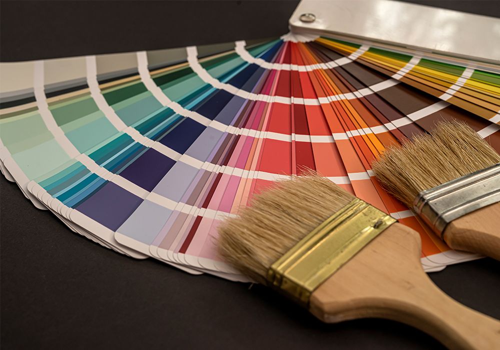
Color has an extraordinary impact on the design of interiors, as it not only determines the looks but also sets the weather within. Like an empty canvas waiting for interpretation, the right color palette for a home will represent who one is and the kind of mood one wants to create.
This guide dives into the world of accent colors exploring 7 spectacular hues and the individual personalities they contribute to a home interior. With their capability to pull out the personality, be the focal point, and the crowning jewel in the design, accent colors are the secret weapon that can bring one out of the comfort zone and let the house speak its own!
1. Emerald Green: Luxurious Tranquility
This gem-like shade perfect for metallic paint walls hints at luxury and taste. Its dense yet subdued color conveys a sense of soothing relief that the nature of a forest can bring to mind. Imagine being part of the verdant many-stranded web of life found in the forest, the delicate canopy filtering the light, one that promotes a serene environment. The soothing quality of this emerald green color is the appropriate candidate for throw pillows, artwork, or even a sensational armchair in a room tinted in a neutral color. Affluence oozes, it provides an ambiance that is not only eyeful but also welcoming of luxurious feelings.
2. Mustard Yellow: Cheerful Sunshine
This light and cheerful color brings a lively and optimistic shift in mood with its bright yellow and pink painted walls. A smile will very often appear on the face and one will feel more happy and light in the heart when catching a glimpse of it. Think about sunflowers thriving in a field in the sunny spring weather, immersing one in a blaze of bright golden beams signaling the arrival of the sunflowers.
Undoubtedly, mustard is superb for kitchen accessories like cutting boards, other mustard yellow can be used for painting the front door in a black-and-white hallway or wallpaper in a reading nook. It reminds us of the indoors even when the outdoor season is not up and brightens up the interior, making it feel vibrant and inviting.
3. Cobalt Blue: Bold Confidence
Cobalt Blue is an incredibly strong statement, daringly and improbably. The image of a vessel crossing the ocean implies assurance and stirs up the expansive feeling that gives energy. It makes one feel as if they could be on top of the world looking from a height above, over cobalt waters roaring underneath, with the endless horizon ahead.
This vivifying essence on the home interior then makes cobalt blue a perfect choice for throw blankets with outsize geometric patterns, a stand-alone bold lampshade in a minimalist living room, or a geometric rug that acts as a mediator for other pieces in the room. Its dramatic inserts enhance the formal atmosphere, the one where people can glance into each other's eyes and communicate with meaningful remarks.
4. Blush Pink: Soft Romance
Tender and romantic, blush pink brings about a sense of relaxation and peace in the home interior. This tone is the embodiment of such warmth and compassion, a perfect match of furniture with a white shade or a wall with a calming gray in the living room. Got an idea about the morning light on the flowers field with their pale opaque petals streaming softly in the air. This tranquility caused by blush pink gives it what it takes to be a good candidate for creating a space that is much calmer and cozier.
5. Terracotta: Earthy Comfort
This organic brown hue is a reminder of the outdoors, reflective of baked clay and the desert-like environments. Clay’s earthy element reminds us of our small spot in the sea of vast expanse. Try to conjure up a little adobe house among the sunlit soil, its dove-gray walls sunny and greeting with open arms. The calming effect of this combination of earthy color gives an artist a variety of different appearances from outdoor pots displayed on open shelves, a statement carpet in the neutral kitchen, to a rug painted on a small piece of furniture simply for the rustic effect. It gives the home interior a feeling of connection to nature, which in turn creates a sense of calm and a feeling of stability.
6. Charcoal Gray: Sophisticated Depth
This soft unexpected and exterior brick texture paint functions as a complimentary color that enhances depth and drama in the space. The darkness that is present thickens the air with a sense of mystery and puzzle. Visualize a smart home interior filled with the foggy glow of twilight; the whitish-gray walls seem to add some sense of urban charm to it.
The dramatic change makes charcoal gray ideal for pillowcases or a change of pattern as a contrast to the white walls of a bedroom and even for pursuing a modern elegance if used as a statement headboard or in a brick-exposed plus looking more like industrial. It manages to create a look that is at the same time polished, and intriguing while remaining perfectly chic for those who love a modern type of style.
7. Fuchsia: Energetic Playfulness
This lively pink is the ideal color for brightening up the dullest of stairs. The natural color scheme connected with flowers and airy character lets one enjoy such a special moment with more fun and a charged feeling. Try to visualize a field of bright fuchsia wildflowers dancing in the gentle breeze, their vivid flowers creating an alluring contrast as they attract the butterflies from one blossom to the next, and they are buzzing with life.
Conclusion
Ultimately accent colors are the key to unlocking the transformation of the living area with all its power. Through a better comprehension of the emotions people may feel and the symbolic representation of each hue, it is possible to construct one’s palette, deviating from the established patterns of interior textured paint and fostering one’s style in each room and the desired ambiance.
Remember, experimentation is key! Flirt with bold combinations to create a dynamic effect, or use pastel-soothing neutrals to produce a tranquil mood. Of all the elements, the main one is to go for the colors that make one feel glad and select the house that is both chic and welcoming. Thus, do not be afraid of the artistic side, be driven by the might of the pops, and see the house as a never-ending, unseasoned canvas rejuvenating with pulsating hues of color!